

Architect-US Interview Series is back with another top-notch interview on Wednesday, May 19th at 12:30 PM EST (🗽 time) on our Instagram LIVE and/or our YouTube CHANNEL. Our CEO Pati Garcia will guide us...

Architect-US Interview Series is back with another top-notch interview on Wednesday, May 19th at 12:30 PM EST (🗽 time) on our Instagram LIVE and/or our YouTube CHANNEL. Our CEO Pati Garcia will guide us...
Architect-US Interview Series is back with another top-notch interview on Wednesday, July 14th at 10:00 AM EST🗽time on our Instagram LIVE and/or our YouTube CHANNEL. Our CEO Pati Garcia will guide us through...
Architect-US Interview Series is back with another top-notch interview on Wednesday, June 30th at 12:00 PM EST🗽time on our Instagram LIVE and/or our YouTube CHANNEL. Our CEO Pati Garcia will guide us through...

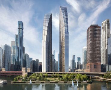
The company, a full service architectural firm, based in New York City, has a broad body of work including private houses, apartments & townhouses, as well as commercial and institutional projects, both...
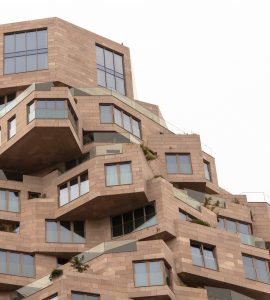
Based in the the amazing city of Ashland, Oregon, the firm develops different types of projects: residential, educational and commercial, among other typologies, going from conceptual ideas till completion...
Architect-US Interview Series is back with another top-notch interview on Wednesday, June 16th at 12:00 PM EST🗽time on our Instagram LIVE and/or our YouTube CHANNEL. Our CEO Pati Garcia will guide us through...
Empathy as a designing core value Hi Architect-US crew, In this blog...
Living in New York changes the way you understand relationships...

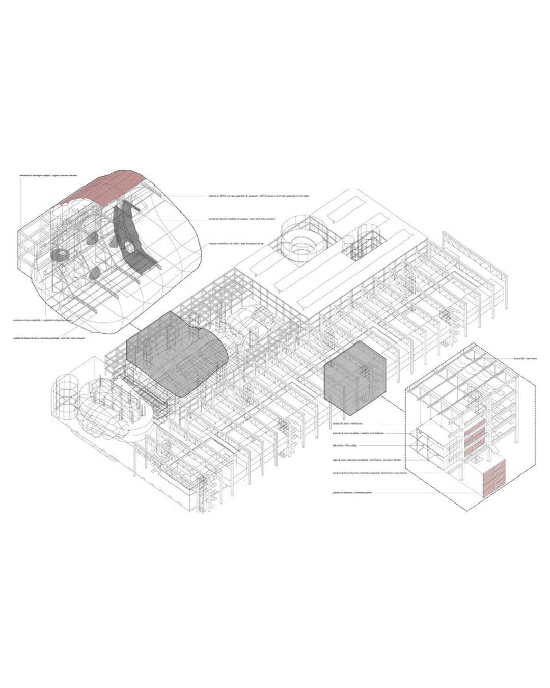
When I arrived at the company I heard about something that...
Hello everyone! January has marked a fresh start and an exciting new...


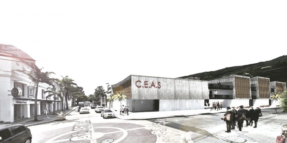
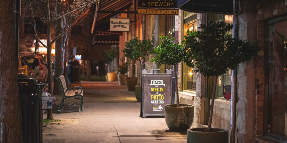
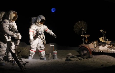
How lighting, programming, and safety shape the nocturnal life of...
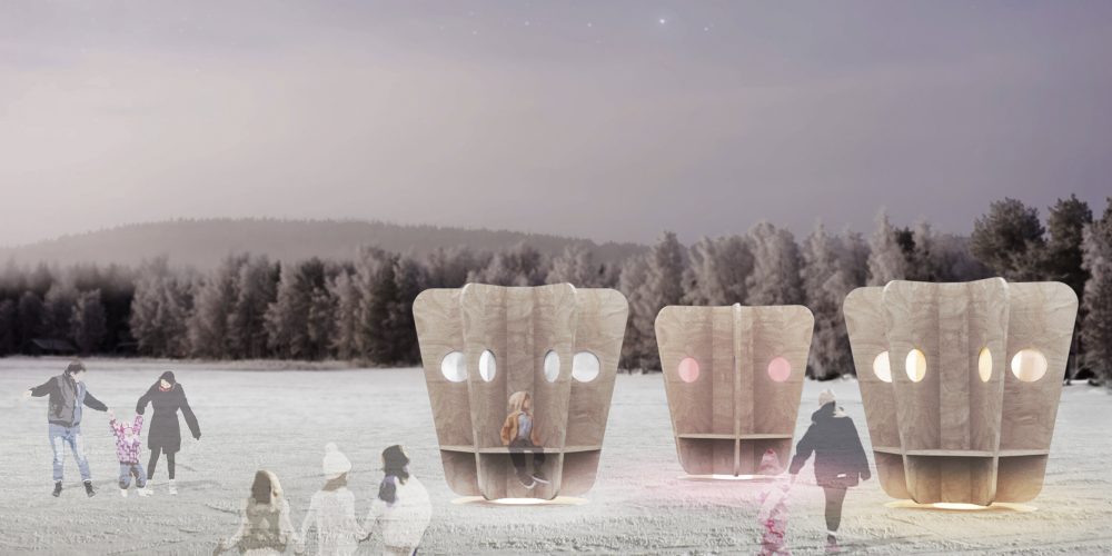
For architecture students and young architects learning to see beyond...


Architect-US The Blog serves as a forum for the exchange of Architect-US participants experiences, ideas and resources, addressing global challenges and bringing the Architectural world closer together.
Copyright © 2016 · Architect-US


