
INTRODUCTION TO THE PSYCHOLOGY OF COLOR
Colors cause perceptions that we must understand:
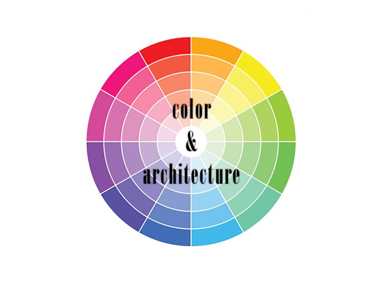
The white sunlight decomposes in colors: red, orange, yellow, green, blue and purple. These colors are divided into primary or fundamental colors (yellow, red and blue ) and secondary colors(orange, green and purple ) arising as a mixture of the above colors.
The colors are also classified in warm colors (red, orange , yellow) and cold colors (blue, green , purple )
Each color has on the person a triple action:
– Impress, draws attention .
– Causes a reaction or emotion, as each color is capable of expression.
– Builds, because each color has its own meaning and acquires a symbolic value.
Warm colors are considered STIMULANTS, CHEERFUL ands EXCITING and cold colors are considered CALM, SEDATIVES and in some cases even DEPRESSING.
Light warm colors suggest FINESSE, FEMININITY, KIDNESS, HOSPITALITY and JOY. Dark warm colors suggest:VITALITY, POWER, WEALTH and STABILITY.
Light cold colors express FRESH, DELICACY, REST, SOLITUDE, HOPE and PEACE. Dark cold colors express MELANCHOLY, DEPRESSION, HEAVINESS and MYSTERY.
>YELLOW/AMARILLO: is SUN, LIGHT, JOY, GOOD MOOD. It stimulates the nerve centers. It is the most INTELLECTUAL color. It means ENVY and RAGE. It symbolizes ARROGANCE, POWER and STRENGHT.
>RED/ROJO: is FIRE, BLOOD, REVOLUTION, PASSION, VIOLENCE and ACTION. Suggests HEAT, EXCITEMENT, MOVEMENT, VITALITY, also CRUELTY and RAGE. It increases muscle tension, breathing activates and stimulates blood pressure. Best suited for people retracted.
>BLUE/AZUL: color of SKY and WATER. It is SERENITY, PEACE, CALM, INFINITE and COLDNESS. It is INTELLIGENCE, WISDOM and TRUTH. It acts as a painkiller.
>ORANGE/NARANJA: is ENTHUSIASM, BURNING, EUPHORIA. It acts to facilitate digestion.
>GREEN/VERDE: is FRESH, NATURE, QUIET, COMFORTING. It is HOPE, SPRING, YOUTH. Color that frees the spirit and balances sensations.
>PURPLE/VIOLETA: is DEPTH, MYSTERY, MYSTICISM, MELANCHOLY. SEDATIVE action.
>PINK/ROSA: is LOVE, ROMANCE, SOFTNESS, DELICACY.
>WHITE/BLANCO: is PURITY, CANDOR, INNOCENCE. It means PEACE.
>BLACK/NEGRO: is the absence of color. It is SADNESS AND GRIEF. Symbol of evil. It slims.
>BROWN/MARRÓN: is EARTH, SIMPLICITY, UTILITY.
>GREY/GRIS: (mixture of black and white) is NEUTRALITY, FUSION OF SADNESS and JOY,OF THE GOOD AND BAD.
>GOLD/ORO: WEALTH and OPULENCE
>SILVER/PLATA: NOBILITY and DISTINCTION
CONTRAST
The color intervenes in the object properties, in the figure-ground relationship and in the perception of the object geometry.
The tone and contrast affect to the apparent dimensions and shapes of the objects:
-A Light color on a dark background seems lighter than it really is. A dark color on a light background looks even darker.
-If the color is more intense it seems to occupy less space. If the color is less intense it appears that its area is bigger.

-Warm colors seem more extensive and cold colors look smaller than they really are.

SOCIAL CHARACTER
Colors most appreciated by people and Colors less appreciated by people:

TOOLS FOR COLOR
Pitaculous:To design color palette from an image.
Adobe Colour: To create color palettes.
Colrd: Library of images in which colors are identified.